Sketch combines the best of Illustrator and Photoshop
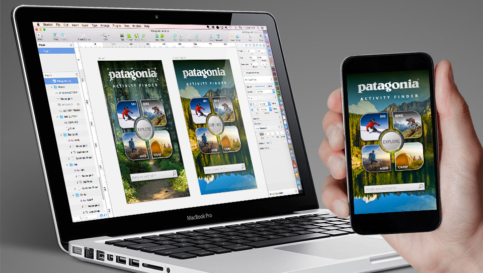
Does your team use Sketch App for digital design? More and more design teams do. We find it useful for creating user interfaces that can be quickly exported for websites, mobile apps and more. It combines the best features of Adobe Photoshop and Illustrator and adds in a cool feature to preview your designs on your iOS device. Below are a few reasons we are excited about what Sketch brings to the world of interface design.
1. Vector-based graphics provide more flexibility. Sketch is a vector graphics editor for Mac, developed by a Dutch software company, Bohemian Coding. Unlike Photoshop which uses raster graphics based on pixels, vector graphics are completely scalable without losing resolution. Although Illustrator is also vector-based, Sketch adds in many of the raster editing tools that Photoshop has to offer, such as basic color-correction tools and raster-based effects like drop shadows and blurs without the need to apply filters. What does all this jargon mean? Graphics you create in Sketch are easier to edit, scale and manipulate without the hassle of dealing with resolution problems.
![]()
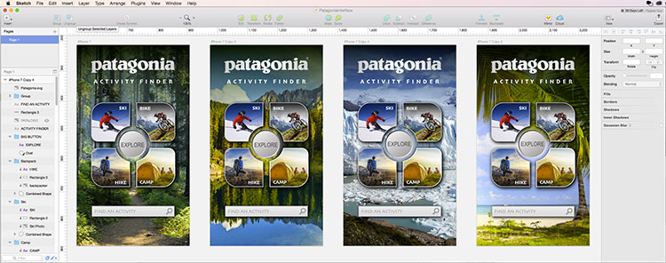
2. Design an entire app or site in one Sketch document. Sketch offers artboards, which are similar to those in Illustrator and Photoshop. But Sketch goes one step further by also offering pages. Artboards let you easily create different versions of each screen (for design options and different screen sizes). And pages are a great way to create the various screens or sections of your project. It gives you more flexibility to build deep digital experiences in one document using shared symbols and styles. Which brings us to our next advantage.

Sketch Artboards
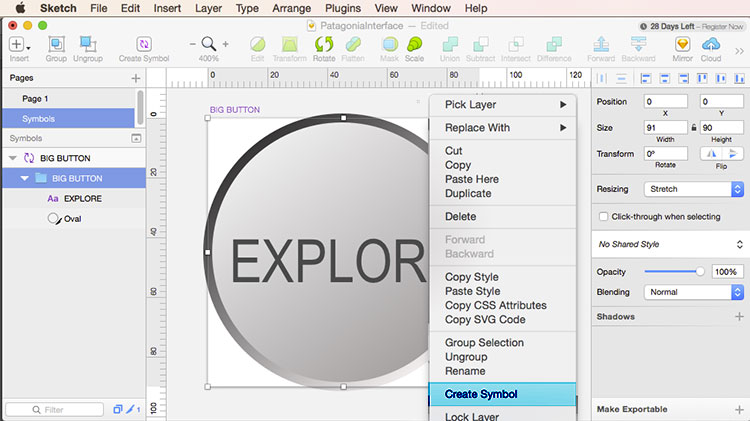
3. Create symbols and styles to save time and maintain consistency. Let’s say your team is building an app that’s going to require 13 design templates. And let’s say you’re designing for compatibility with 5 different device screen sizes and you have an average of 2-3 design options per screen. If each screen has a universal button on it, you could have well over a hundred instances of your button. Now let’s say a stakeholder requests a change to that button. If you used one symbol for all those buttons, you could change one and they all would update automatically. The same goes for text and graphic styles. Sketch makes symbols and styles powerful and easy to use – making your design team more agile and responsive during development.

Sketch Symbols
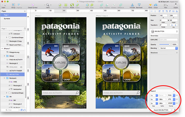
4. Exporting for developers is a snap. Sketch offers a slice tool that is similar to Illustrator and Photoshop, which is great for exporting a certain area of your artboard. But Sketch offers an additional tool that can be a big time saver: the ability to select a layer or group and make it exportable without the need to manually draw a slice. This is a big time saver for elements of the design such as buttons or other individual graphics. And everything you export from Sketch can be setup to automatically export in multiple sizes and file formats – which is particularly helpful when designing for devices with different resolutions.

Sketch Export Options
5. Cost and simplicity. At a cost of only $99, Sketch can be seen as much more affordable than Illustrator and Photoshop, which Adobe now dictates must be purchased as a subscription service. And Sketch’s interface is simpler and easier to use than either. Of course, one reason it’s simpler is because it’s not nearly as robust. But when it comes to designing user interfaces, many design teams find that Sketch offers 90-95% of the features they need on a daily basis. That makes it an attractive alternative for freelancers or rapidly growing design shops.
Will Sketch start eating into Adobe’s market share? Only time will tell. Software adoption is a difficult thing to predict. And with Adobe’s vast resources, they are probably already working to counter this new competition. But given the buzz about it in social media and industry blogs, it’s possible that Sketch could end up as a paradigm shift in digital design software.

